The Remarkable Journey of British Rail's Logo
Step onto the platform of any railway station in the United Kingdom, and you’ll find yourself surrounded by an enduring symbol of British Rail’s legacy. The double arrow logo, conceived by designer Gerry Barney over 60 years ago, stands as a testament to timeless design and unwavering relevance. Despite the public’s waning affection for British Rail as an organization, this elegant symbol quietly continues to thrive, adorning signs, tickets, and websites, representing the nation’s railway system.
The Transformation of British Rail
In the early 1960s, British Railways was undergoing a significant transformation. As the nationalized rail network created by the Attlee government in 1948, it sought to shed its association with the steam age and embrace a modern, streamlined identity. This revolution was fueled by a secret weapon—an innovative corporate identity. The heraldic badge with a red lion, symbolizing the steam era, made way for a sleek sans-serif type and a cohesive identity system. Inspired by Canadian Railways’ revolutionary CN device, the British Railways Board was determined to embark on a journey of modern corporate identity.
In 1960, young a 21-year-old named Gerry Barney applied for a position as a lettering artist at the esteemed Design Research Unit. To his delight, he secured the job and quickly formed a close bond with Milner Gray, the co-founder of the studio, despite their significant age difference. At the time, Gerry saw himself primarily as a lettering artist rather than a designer. When the studio’s designers delivered design concepts for the British Rail logo brief in 1965, which didn’t quite satisfy Milner, he decided to involve the rest of the team, including Barney and six others. Serendipitously, it was Barney who conceived the symbol that would become iconic.
As fate would have it, he conceived the design during his daily commute on the London Underground. He sketched the design on the back of an envelope, and upon arriving at the office, he meticulously transferred his vision onto paper. The symbol he had created, consisting of two tracks and a set of points, perfectly encapsulated the brief’s requirement for timelessness. DRU produced around 50 symbols, but Barney’s creation stood out, alongside a design by Collis Clements, featuring two circles and an arrow.
In a twist of fate, Clements’ design was leaked to the press, rendering it unusable. The extensive collaboration involved in creating presentation materials left designs vulnerable to exposure. With only Barney’s design remaining, its simplicity and immediate impact captivated the decision-makers, ensuring its selection as the emblem of British Rail.
The Artistry of Barney's Symbol
Upon closer inspection, Barney’s symbol reveals a level of intricacy beyond its initial simplicity. Rooted in his background as a hand lettering artist, he applied subtle nuances to ensure visual harmony. The lines, although appearing uniform, subtly vary in thickness, enhancing the visual appeal. Drawing inspiration from lettering, Barney employed an understanding of counters and negative space, resulting in a cohesive design where every element works in harmony.
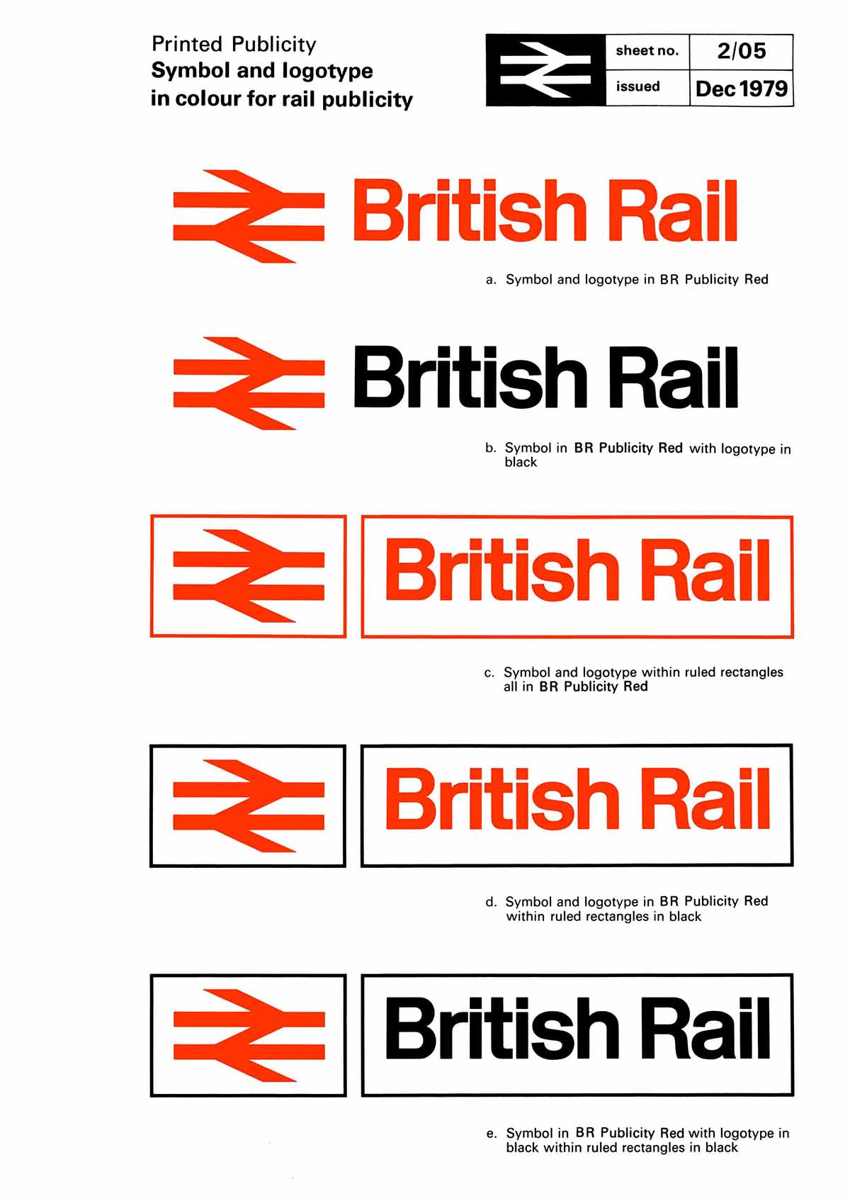
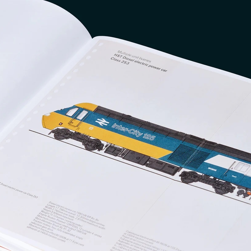
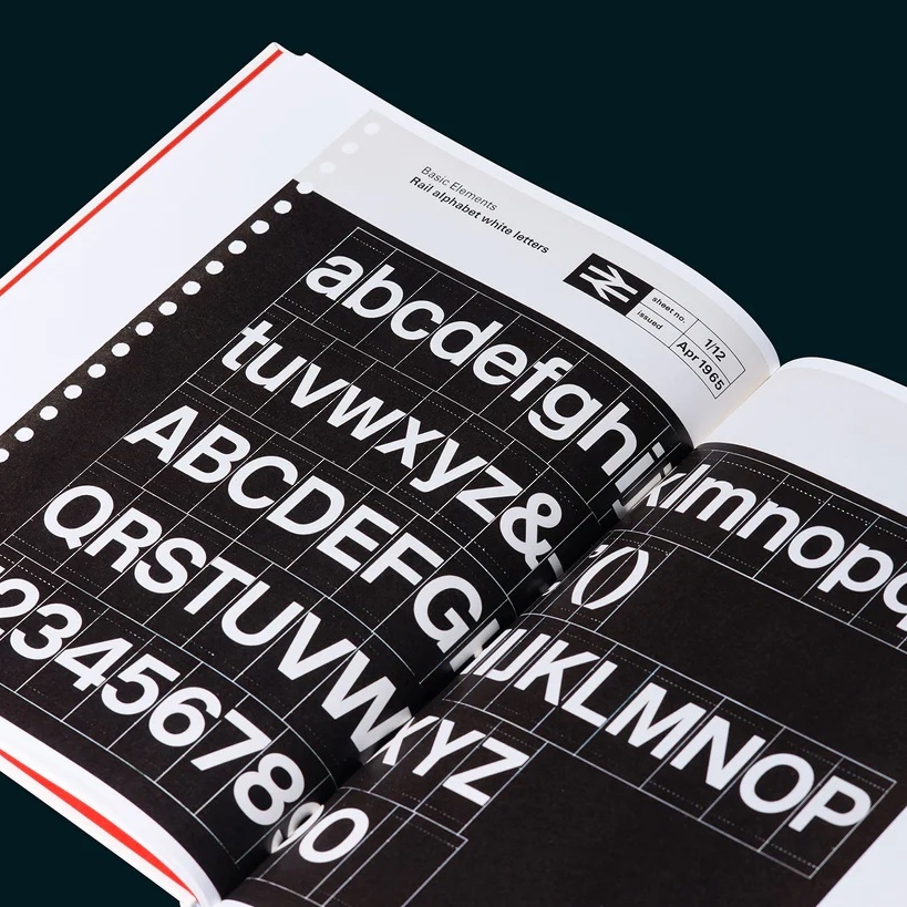
Writing about the project in 1965, Robert Spark emphasized the monumental task undertaken by DRU—to create a comprehensive identity system for British Rail. Four fundamental visual elements came together: a symbol, a logotype, a name-style, and house colors. These elements needed to permeate every aspect of the railway system, from locomotives and rolling stock to stations, signposting, uniforms, and even print and publicity materials. The scale of this endeavor, even by today’s standards, is a testament to the far-reaching impact of Barney’s symbol.
The power of pictograms lies in their ability to transcend language barriers. Barney encapsulates this principle, highlighting how the double arrows device effortlessly communicates across various mediums, from posters to uniforms and even cutlery. In contrast, the complex and convoluted logotypes employed by different railway companies lack the immediate impact and universality offered by iconic symbols like London Transport’s. Over time, the words “British Rail” began to fade from the symbol, allowing the double arrows to speak for themselves.
Looking Back with Appreciation
During that era, the Design Research Unit was infused with the captivating essence of German and Swiss design—a style that left an indelible mark on the industry. This influence was particularly notable in the iconic Rail Alphabet typeface created by Jock Kinneir and Margaret Calvert for the organization. Sixty years later, the influence of German and Swiss design on DRU’s work is evident. Barney vividly recalls the dynamic atmosphere, citing a packaging concept for Ilford by DRU that bore a striking resemblance to Geigy, a prominent Swiss design company. It was a time of significant change, with people gravitating toward clean and modern aesthetics, stepping away from traditional typefaces. CN, in particular, encapsulated this shift. While undeniably sleek, Barney admits that if not handled with care, such minimalist design could veer into the realm of blandness, draining the vitality from its subjects. In hindsight, there might have been an overabundance of this style, but during that exhilarating period, everyone wanted to embrace it.
Barney’s boundless creativity led him to explore ambitious ideas, including one that envisioned the BR symbol as a supergraphic device—a design element that would dominate the entire train engine. Envisioning a visually captivating masterpiece, he eagerly presented his initial designs. However, the audacity of his concept proved a bit too much for the conservative sensibilities of British Rail. Reflecting on that moment, Barney fondly remembers the striking impact of his proposal, which covered practically every inch of the engine, exclaiming, “I had it covering practically the whole engine. It looked bloody great, but they wouldn’t do it.” Regardless, Barney’s double arrow symbol lives on, registered as a trademark under the Secretary of State for Transport, proudly representing the Association of Train Operating Companies across the UK network.
Arrows of Certainty
As we reflect upon the indelible mark left by Gerry Barney’s double arrow symbol, we are reminded of its enduring relevance and timeless appeal. This emblematic design, born out of the transformative era of British Rail, transcends language barriers and speaks to the essence of railways—parallel lines, journeys, and destinations. Barney’s creation continues to serve as a visual testament to the power of simplicity and the enduring impact of thoughtful design.
About the Author

Related Posts
Brand Watch: The RSPCA Gets a Complete Rebrand for the First Time in 50 Years
Fresh off the shelves is a complete…
The Best Movie Posters of 2023
As far as movie poster designs go, 2023…

The Future of Graphic Design: The Impact of AI and the Role of Human Creativity
The graphic design industry is…

Appreciating a Brilliant Piece of Advertising by the Norwegian Seafood Council
From time to time, you come across…