The Mexico '68 Olympic branding is revered to this day, perfectly encapsulating the wild experimentation and creativity of design in the 1960s
From the brilliant mind of Lance Wyman, the bold visual style was a perfect mirror for Mexico's transformation & growth as a society at the time, and remains still the benchmark against which all Olympic Games branding is measured
With the 2024 Paris Olympics now in full swing, I thought it would be a good time to look back at one of my favourite pieces of branding work ever. At certain points in the history of design, creations have appeared that transcend their era, evolving into symbols that define the very essence of a period. Lance Wyman’s identity for the 1968 Mexico Summer Olympics is one such creation, lauded as a masterpiece of branding and wayfinding that forged an unparalleled sense of space amidst the extravagant architecture typical of the Games. Yet, it is the context of its creation and its significance as a cultural artifact that render it a compelling case study in the accretion of meaning, demanding a closer examination.
Olympic design often serves a dual purpose, acting as both a global spectacle of peace and a potent instrument of nationalist propaganda. The Mexico City Olympics identity embodies this duality, bridging the conflicting ideologies of a nation grappling with its own modernity and, for a time, its own people. The year 1968 was marked by widespread turbulence, and Mexico was experiencing profound social unrest as students took to the streets, demanding greater transparency, the release of political prisoners, an end to corruption, and accountability for the government’s brutal repression. The crescendo of this movement occurred just ten days before the Games, when thousands gathered in Tlatelolco for a peaceful demonstration. The Mexican authorities responded with violence, resulting in a massacre the true extent of which remains shrouded in mystery. Remarkably, the government concealed the magnitude of the tragedy and proceeded with the “Games of Peace.”
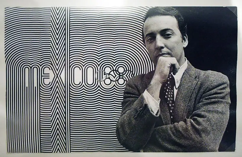
It was into this charged atmosphere that a 29-year-old designer, Lance Wyman, arrived in Mexico City, unknowingly stepping into the heart of a revolution. As the lead graphic designer for the Games, Wyman collaborated with an international team to create a visual identity that would resonate with the world. To comprehend the significance of their work, it’s crucial to understand the context in which it was conceived. Mexico’s selection as host was controversial due to its high altitude, which favoured some sports over others. The nation had recently experienced economic growth, thanks to the “Mexican Miracle” development strategy, and aimed to leverage the Games to showcase its progress to a global audience. The design campaign had to be distinctive and memorable, effectively “selling” Mexico to visitors while fostering a positive image for the country.
Mexico launched an international competition to find a designer capable of creating a contemporary, cosmopolitan design infused with Mexican influence. Wyman and his partner, Peter Murdoch, embarked on a trial period in Mexico City, neither having visited the country before. Their fresh perspective allowed them to see the city through the eyes of first-time visitors, much like the millions who would attend the Games.
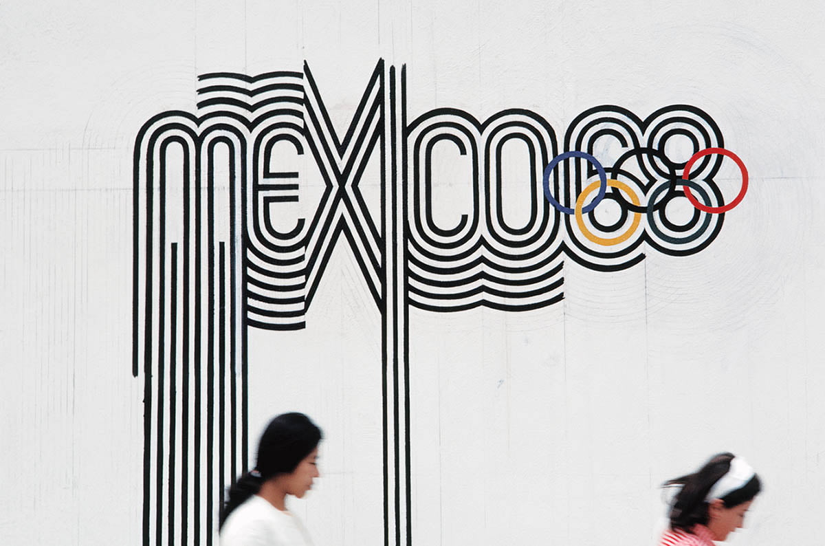
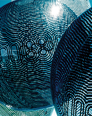
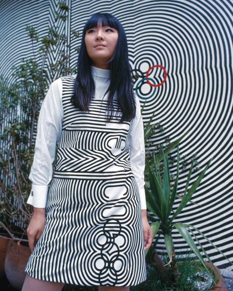
The design process began with visits to tourist sites and museums, particularly the Museum of Anthropology, which housed artifacts from pre-Columbian Mexico. Wyman observed a connection between the bold lines, geometric shapes, and vibrant colours of Mexican art and the optical art movement gaining traction in New York. This realization became the foundation for the hypnotic logo, which seamlessly integrated the Olympic rings into the number 68, creating a visually striking symbol. The geometric pattern of the logo was then extended to create a typeface that was used throughout the city to promote the Games. Wyman’s multi-stroke typeface became synonymous with the event, forming a unique brand identity.
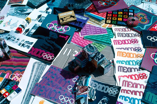
Wyman and Murdoch remained in Mexico for two more years, working with a predominantly Mexican team of designers to expand the branding campaign. Their ideas extended beyond the logo and typeface, influencing everything from staff uniforms to promotional merchandise. The branding campaign was not merely about aesthetics; it also addressed a practical challenge: navigating the vast city. A colour-coded map was designed for easy navigation, featuring the familiar typeface for stadium names and contrasting colours for roads.
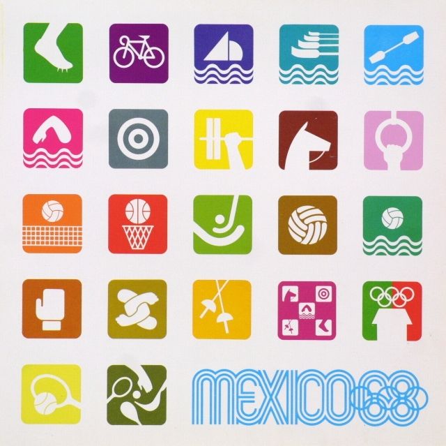
Each stadium was painted with a distinct colour optical pattern, corresponding to the map’s colour scheme, creating a striking and user-friendly wayfinding system. Coloured banners hanging from street lights further enhanced the visual cues. Simple, colour-coded icons representing different sports were also developed, featuring stylized body parts, equipment, or a combination of both.
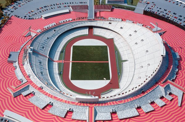
The Mexico Olympics branding campaign was unprecedented in its scope and cohesion. Logos, typefaces, colours, and icons adorned the city, uniting diverse elements under a single visual language. Wyman’s designs set a new standard for Olympic branding, demonstrating the power of design to connect a city and its visitors. His work had a profound impact, inspiring subsequent Olympic branding efforts and leaving a lasting legacy in the world of design.
The influence of the Mexico Olympics branding extended far beyond the Games themselves. In 2003, the Museum Boijmans van Beuningen in the Netherlands adopted a new identity inspired by Wyman’s three-stroke typeface. The museum’s logo, designed by Armand Mevis and Linda van Deursen, referenced both the museum’s architecture and the collaboration between its founders. The courtyard was even painted with optical patterns reminiscent of the Mexico City stadiums, further demonstrating the enduring impact of Wyman’s iconic design.
About the Author
Related Posts
David Carson: The Accidental Revolutionary Who Gave Graphic Design a Punk Makeover
For graphic designers of a certain…

Penpot vs. Sketch: A Comprehensive Comparison for the Discerning Design Professional
In the rapidly evolving landscape of…
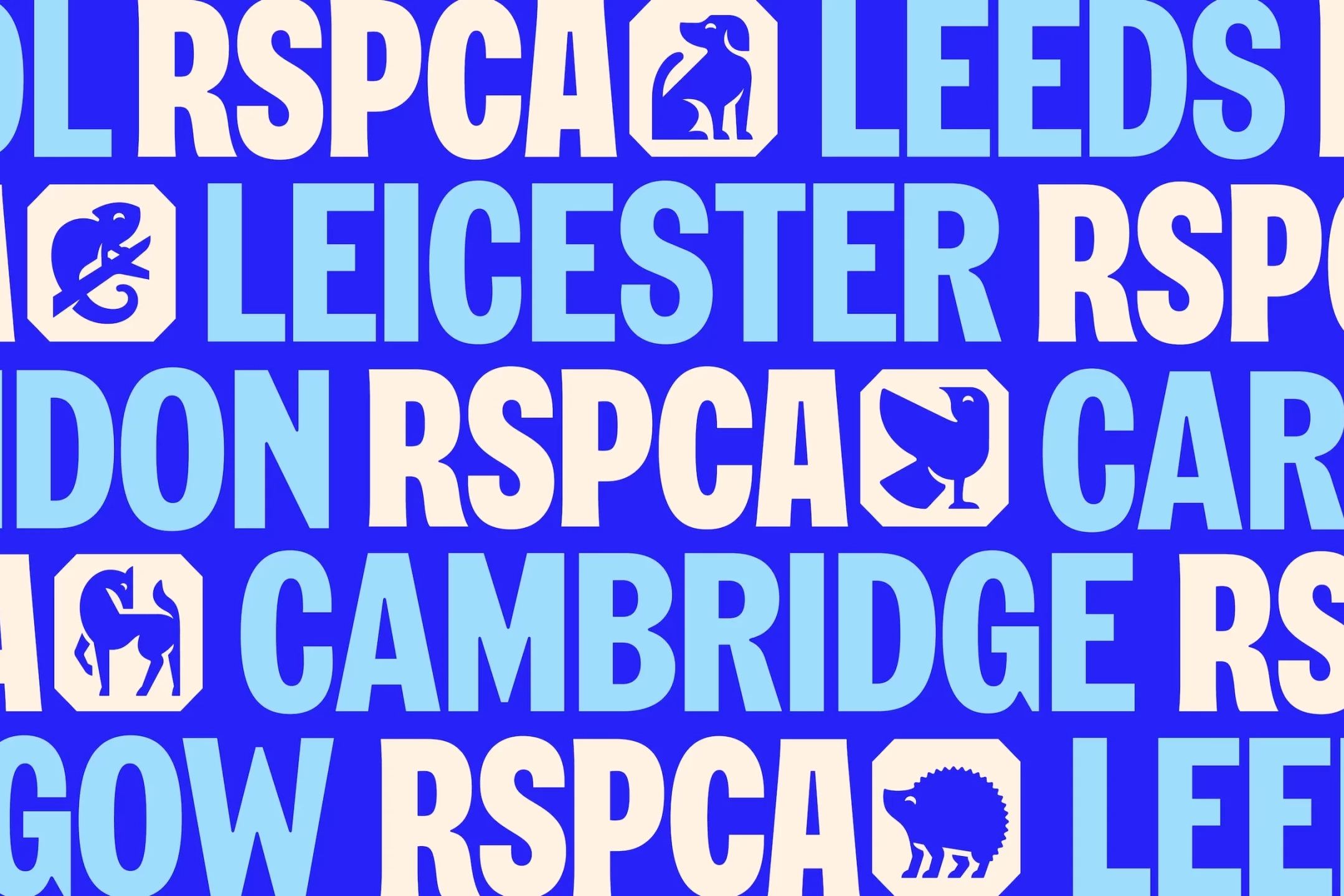
Brand Watch: The RSPCA Gets a Complete Rebrand for the First Time in 50 Years
Fresh off the shelves is a complete…

The Future of Graphic Design: The Impact of AI and the Role of Human Creativity
The graphic design industry is…