The Movie Posters that impressed me in 2023
As far as movie poster designs go, 2023 was a strong year in my opinion. There was great variety and strong concepts among even the blockbusters, which does not always tend to be the case. Par for the course is playing it safe with easily digestible poster designs that get the message across without ever really stopping you in your tracks. In the last 12 months however, there have been numerous examples of posters that demanded attention and showcased genuine originality, even if the respective movie didn’t quite achieve the same standard. Read on for my 10 favourite poster designs of 2023 (in no particular order).
The Killer
Directed by David Fincher

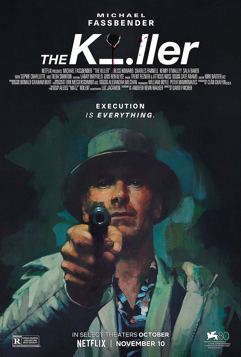
“The Killer” is an action thriller film directed by David Fincher and starring Michael Fassbender. It follows a cold and methodical assassin who becomes entangled in a web of deceit and violence after a hit goes wrong. The film is based on the French graphic novel series of the same name and explores themes of morality, loyalty, and the psychological toll of a life of killing.
The poster design perfectly captures the many themes of the film and does so in a visually stylish and devilishly simple way. From the gritty oil painted/textured look, do the deadness in Fassbender’s eyes and the brilliant use of the horizontal letter ‘i’ in the title itself, the poster design is a masterclass in static image storytelling. On top of these, you also have the focal point of the image which is the gun itself, pointed directly at the viewer for maximum effect. Like all great movie poster designs, It simply demands your attention. Also, the tagline ‘Execution is Everything’ is utterly sublime.
Anatomy of a Fall
Directed by Justine Triet

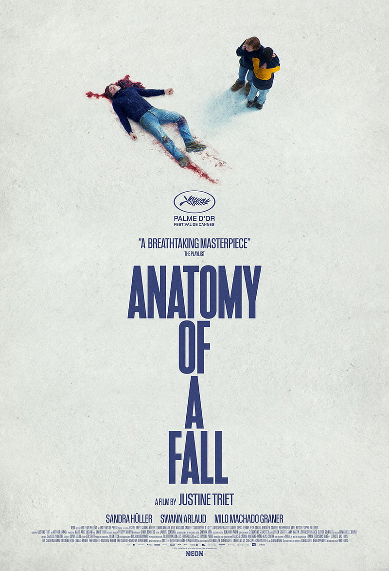
“Anatomy of a Fall” is a French legal drama thriller directed by Justine Triet. The story centers around a writer, Sandra, who becomes the prime suspect in her husband’s mysterious death. As the investigation unfolds, the film delves into the complexities of their relationship, raising questions about truth, deception, and the line between love and hate. Sandra’s son, who has visual impairments, becomes a key witness, adding another layer of emotional weight to the unfolding drama.
One of my personal favourite movies of 2023, “Anatomy of a Fall” is a masterclass in drama and suspense. Its poster too is both eye catching and powerful, and does a great job of telling a story with minimal detail. From the top, you have the body lying on the ground with the blood splattered snow surrounding it. Alongside its upper left positioning, it serves to draw your attention immediately. Next to the body, two people stand close by. One is looking at the body while using a mobile phone and offering a comforting embrace and shoulder to cry on for the other person who, is innocently turned away from the horror. The contrast is brilliant. We then have the stacked title text using a vertically inclined, condensed font to give an extra sense of height. The descending nature of the text gives a sense of falling as your eyes move down the poster. It’s all thoroughly well thought out and a terrific example of simple, effective design.
The Zone of Interest
Directed by Jonathan Glazer

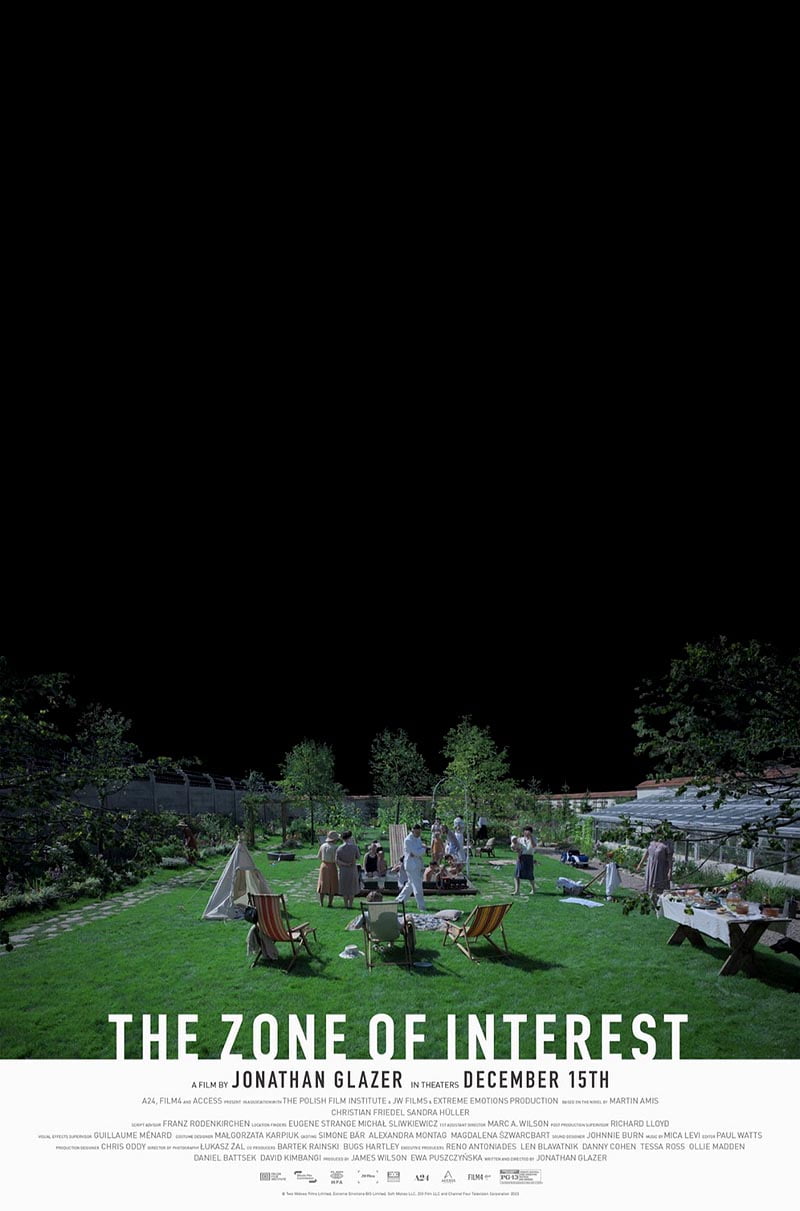
“The Zone of Interest” is a chilling historical drama directed by Jonathan Glazer. It takes a disturbing look at the Holocaust through the eyes of Rudolf Höss, the commandant of Auschwitz, and his wife Hedwig. The film explores the banality of evil as the couple goes about their seemingly normal domestic life right next to the horrors of the concentration camp. This unsettling juxtaposition forces the audience to confront the depths of human depravity and the capacity for normalcy in the face of unimaginable cruelty.
Easily the most uncomfortable movie to watch on my list, “The Zone of Interest” is nonetheless a tour de force from director Jonathan Glazer. The poster is very distinctive and immediately stands out for its use of empty black space to signify everything that exists in the world outside the Höss family garden. The contrast between the beauty and ambiance of the garden itself, with its vibrant greens, tended lawn, greenhouse and relaxed inhabitants and the stark, bleak blackness of the horrors that surround it, is jarringly powerful. The tall barbed wire fence on the left of the image stands as the only indication that something is out of place in this otherwise idyllic setting. It’s the symbolic border between dreams and nightmares manifested.
Poor Things
Directed by Yorgos Lanthimos

“Poor Things” is a darkly comedic and offbeat film directed by Yorgos Lanthimos. Set in Victorian London, it tells the bizarre story of Bella Baxter, a young woman revived by an eccentric scientist after a suicide attempt. The twist? Bella’s mind is that of the scientist’s unborn grandchild, giving her the body of an adult with the innocence and curiosity of a child. As Bella’s intelligence blossoms, she embarks on a journey of self-discovery, navigating societal expectations, quirky characters, and even a love triangle, all while grappling with the unconventional circumstances of her existence.
While I must admit to having not seen “Poor Things” yet (it’s on my list!), I can say that I was highly impressed by its unique poster. Firstly, the baroque styling is very distinctive in its own right and demands attention. Secondly and most prominently, the concept used to signify the premise of the story is extremely well executed. The vision of an entire person in place of the head of another person is brilliantly original and really captures the separation between the familiar physical body of Bella and the infant mind that now inhabits it. It’s just such a strong concept that it can stand on that attribute alone and be highly effective.
Saltburn
Directed by Emerald Fennell

“Saltburn” is a psychological thriller with dark comedic elements, written and directed by Emerald Fennell. It follows Oliver Quick, a working-class student at Oxford, who becomes fixated on his affluent classmate, Felix Catton. Felix invites Oliver to spend the summer at his family’s grand estate, Saltburn. What starts as a glamorous escape soon takes a sinister turn. Oliver’s fascination with Felix and the wealthy lifestyle unravels as dark secrets and a twisted game of desire and obsession begin to unfold within the opulent walls of Saltburn.
One of the sleeper hits of the year and a no doubt future cult classic, “Saltburn” is a gripping and visceral watch. Its poster too, perfectly captures the atmosphere of the film – a silhouetted figure of a young man wearing nothing but boxer shorts, shrouded in a haze of cigarette smoke with large, stately colonial windows framing him as he cracks a devilish pose. This, combined with the muted, burnt tones in the image, the use of the gothic styled blackletter font and the vibrant red colouring of the title gives you the sense that there is something sinister lurking just beneath the veneer of opulence and regality. It’s a brilliantly executed piece of design that immediately grabs your attention.
Oppenheimer
Directed by Christopher Nolan

“Oppenheimer” is an epic biographical thriller directed by Christopher Nolan. It explores the life and complex legacy of J. Robert Oppenheimer, the enigmatic physicist who led the Manhattan Project and oversaw the development of the atomic bomb during World War II. The film delves into Oppenheimer’s motivations, anxieties, and the moral weight of his creation.
Christopher Nolan’s latest epic was one of the most anticipated movies of the year and with good cause. When I first heard that Nolan would be taking on the challenge of bringing to the screen the story of one of the most remarkable people of the 20th century, I could barely contain my excitement. The announcement that the always brilliant Cillian Murphy would be filling the lead as the titular character was simply the cherry on top. It had the potential to deliver a momentous experience, and deliver it did. One of my favourite movies of the year without doubt. Aside from that, its poster design too was also able to capture perfectly the essence of the film and of Oppenheimer himself. It’s not a daring design or one that necessarily pushes the boundaries of conceptual design in any way, but it simply works really well in a traditional design sense. The intensity and energy in the poster are what first jumps out at you – the imposing image of the plutonium bomb, nicknamed “Gadget”, towering over a pensive looking Oppenheimer as fire, sparks and smoke envelope the atmosphere around them. Contrasted with the muted simplicity of the sans-serif font used for the title, with its widely tracked lettering, and this design simply does what it needs to do in a highly effective way.
Killers of the Flower Moon
Directed by Martin Scorsese

“Killers of the Flower Moon” is a historical crime drama directed by Martin Scorsese. Set in 1920s Oklahoma, it tells the true story of a series of murders targeting members of the Osage Nation after oil was discovered on their reservation. The plot follows Ernest Burkhart, a white rancher who marries into the Osage tribe, just as violence erupts. As his wife Mollie’s family members are mysteriously killed, Ernest gets drawn into the FBI’s investigation, revealing a web of corruption and greed amongst those who seek to steal the Osage wealth. Expect a suspenseful drama exploring themes of justice, racial tension, and the ruthless pursuit of riches.
Martin Scorsese’s first movie since 2019’s “The Irishman” was hotly anticipated. Not just because Scorsese is one of cinema’s greatest craftsmen, but because it reunited him with the always brilliant Leonardo DiCaprio, a combination which has worked so well previously. “Killers of the Flower Moon” is a truly harrowing watch, highlighting the greed, injustices and discrimination faced by the people of the Osage Nation during the early to mid 1920s in the United States. Despite its bleak story and often disturbing visuals, the movie is still a masterpiece in my opinion and well worth watching for anyone. It also gave us one of the most memorable posters of recent times. Titled “Morning Prayer” and created by Osage Nation resident and professional artist / graphic designer, Addie Roanhorse, this poster wasn’t used as the movie’s main poster, but as one of a few artistic alternates. It quickly gained a cult following online due to the striking nature of the hand painted artwork. The muted background, contrasted with the bright colours of the woman’s cloak combined to make the poster very eye-catching, while also being immediately identifiable as Native American. There is also added poignancy to it given the fact that it was created by a member of the Osage Nation itself, which was a really nice touch. All in all, a brilliant piece of artwork and design and one that will live long in the memory.
Napoleon
Directed by Ridley Scott

“Napoleon” is a historical epic directed by Ridley Scott. It chronicles the rise and fall of French Emperor Napoleon Bonaparte. The film focuses on both Napoleon’s ruthless ambition and climb to power, as well as his passionate but volatile relationship with his wife, Josephine.
“Napoleon” seemed to polarise viewers upon release, but I thought it was an enjoyable movie. I’m not a historian, nor do I have more than a surface level understanding of Napoleon Bonaparte’s life story, so many of the supposed historical inaccuracies were lost on me. I just enjoyed the movie for what it was – a good story with excellently photographed scenes and some top notch action choreography. The French were outraged by what they saw and maybe justifiably so, but then again, when have the French last not been in a state of outrage? It’s in their DNA! I jest. Perhaps they can console themselves with the fact that the poster design is pretty nice. It doesn’t have much going on in it, but it doesn’t need to. Napoleon is the star of the show and rightly commands all the attention, with his roaring face and charging battle pose capturing the essence of his persona perfectly. The bold, contrasted red title text sits really well and jumps out on the faded, blue tinted background. The sword sitting above the text is also a nice touch and gives an extra sense of depth to the design. The sparks along the bottom of the image hint that an intense battle is raging out of view, not far from Napoleon. All in all, the poster conveys everything it needs to convey and does so with minimum fuss, just like all great posters should. Now, cheer up French people!
John Wick 4
Directed by Chad Stahelski

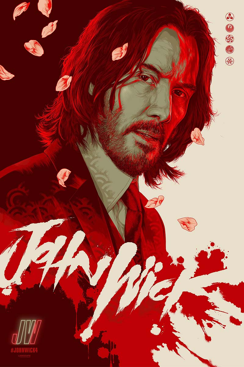
John Wick: Chapter 4 (or John Wick: Consequences, as it was titled in Japan) is a neo-noir action thriller directed by Chad Stahelski. Keanu Reeves reprises his role as the legendary assassin John Wick. This installment finds John Wick continuing his fight against the High Table, the ruthless organization of assassins that has declared him excommunicado. With a new path to potentially earn his freedom, John must face off against a powerful new enemy with global reach.
I’m always excited when a new “John Wick” movie comes around, mostly because they are just so fun to watch. The ultimate popcorn action movies. And who doesn’t love Keanu Reeves? This time however, there was a cherry on top in the form of an incredible alternate poster. First appearing on Reddit in a post by the movie’s producers Lionsgate, this poster became an instant fan favourite for it’s unique, Japanese themed visual styling. The brush stroke effects, the colours, the falling cherry blossoms and the clever use of the roman numerals “IV” in the “JW” text on the bottom left all give this poster incredible style and perfectly present John Wick as this clinical, masterless, wandering warrior or ronin. As a movie poster, it is an incredible piece of design work and the perfect way to round off this list.
If you’ve made it this far, well done and thank you for reading! I hope you enjoyed this rundown of my favourite movie posters of 2023. Let’s hope 2024 will have produced more of a similar quality when I make the relevant post again this time next year.
About the Author

Eoghan Conmey
I am an experienced designer who specialises in logo design & branding, website design & development, 3D modeling and photography. I enjoy learning about the history of design and studying the thought processes and design journeys of some of the most iconic brands in history.
Related Posts
30th April 2024
Brand Watch: The RSPCA Gets a Complete Rebrand for the First Time in 50 Years
Fresh off the shelves is a complete…
24th June 2023
Iconic Brands: The Timeless Legacy of British Rail
Step onto the platform of any railway…
19th February 2023
The Future of Graphic Design: The Impact of AI and the Role of Human Creativity
The graphic design industry is…
7th May 2022
Appreciating a Brilliant Piece of Advertising by the Norwegian Seafood Council
From time to time, you come across…


