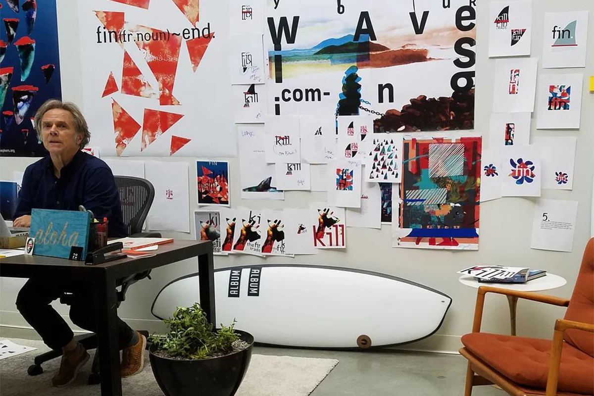
From Surfer to Design Maverick
For graphic designers of a certain vintage (myself included!), David Carson’s chaotically beautiful grunge design style was the gold standard against which all design was to be measured. At one point, it seemed that every student I worked with was referencing Carson’s trademark grunge aesthetic in their sketchbooks and notepads. His influence was ubiquitous. Unbounded and refusing to be confined by the traditional rules of print design, Carson did for graphic design what Nirvana did for rock music. He reset the paradigm and forever changed how designers approached their work.
The Texas born graphic designer remains a figure of enduring fascination and debate. For some, he’s a visionary, a rule-breaker who injected a much-needed dose of punk energy into the staid world of typography. To others, he’s a charlatan, a purveyor of illegible nonsense masquerading as design. But regardless of one’s personal taste, there’s no denying Carson’s impact on the field, particularly among aspiring designers who see in his work a permission slip to break the rules and embrace their own unique vision.
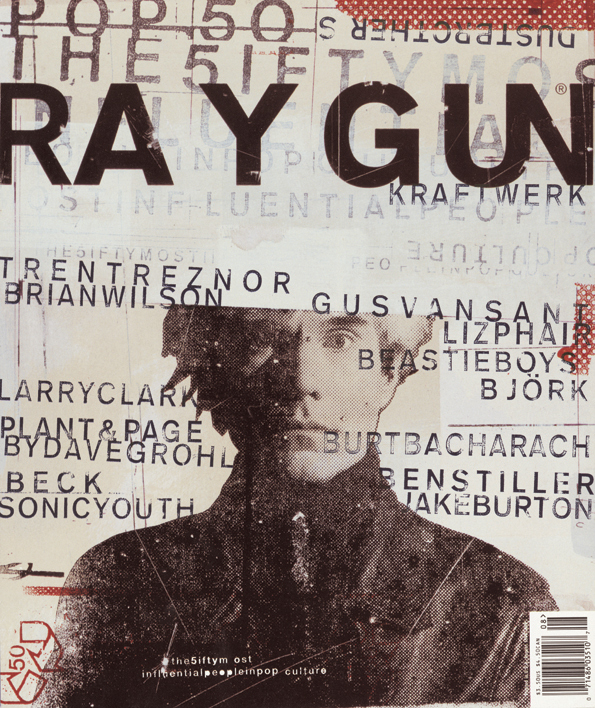
Carson’s rise to prominence was as unconventional as his designs. A self-taught surfer-turned-designer, his big break came when he was appointed art director of Ray Gun, a cutting-edge music magazine. It was here that he unleashed his signature style, a riotous collage of clashing fonts, distressed textures, and seemingly haphazard layouts.
A Masterclass in Subversion
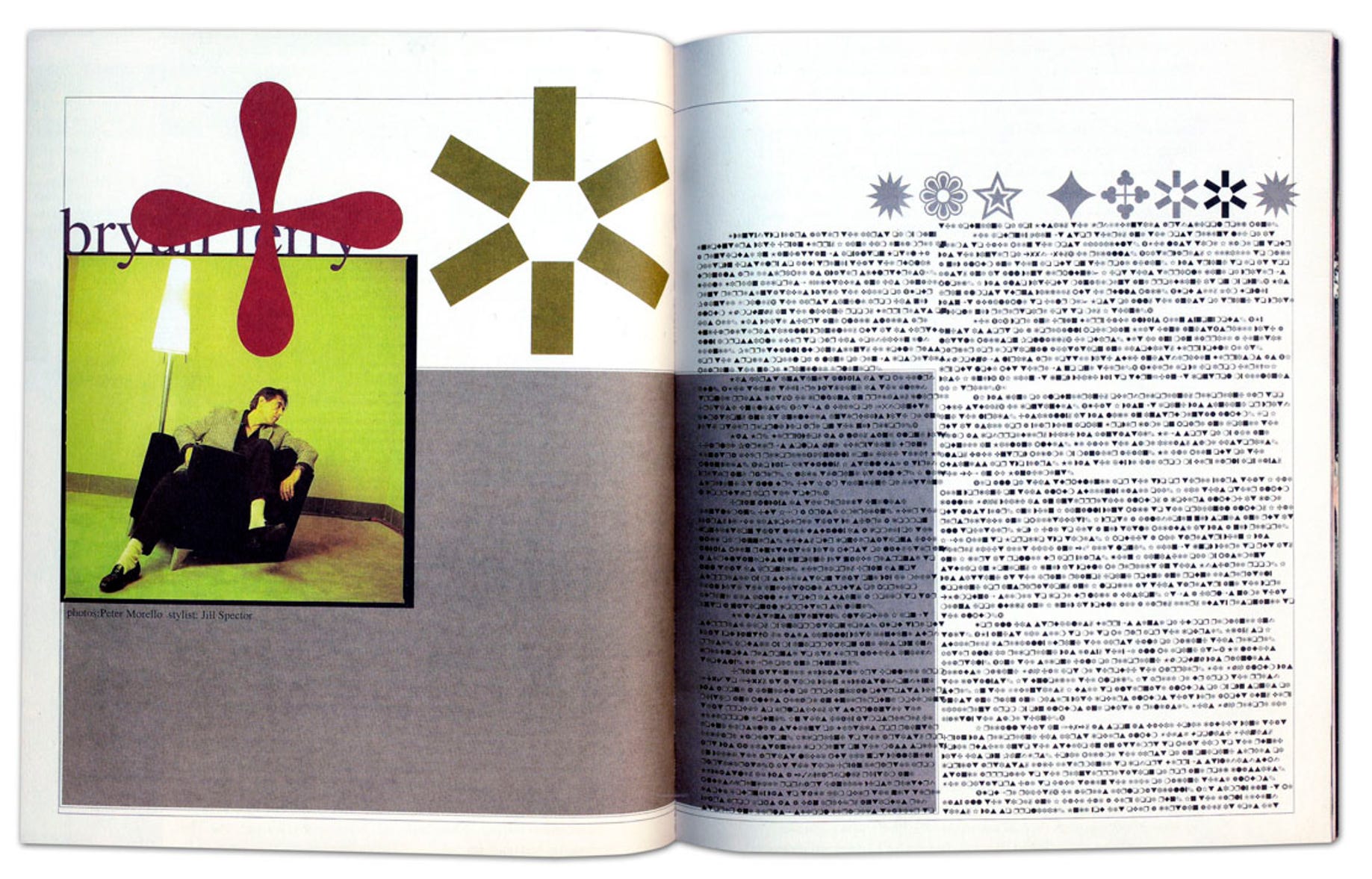
One of his most iconic creations for Ray Gun was the Bryan Ferry interview, where, finding the interview dreadfully dull, he set the entire piece in the illegible symbol font Zapf Dingbats. It was a bold move that sparked outrage and acclaim in equal measure, but it cemented Carson’s reputation as a maverick who wasn’t afraid to challenge the status quo.
Another memorable piece was his spread for an interview with the band Sonic Youth. Here, Carson eschewed traditional portraiture, instead using a photo of the band’s equipment, with the names of each member scrawled across the image in different fonts and sizes. It was a visual representation of the band’s raucous sound, a chaotic yet harmonious blend of disparate elements.
Beyond Ray Gun
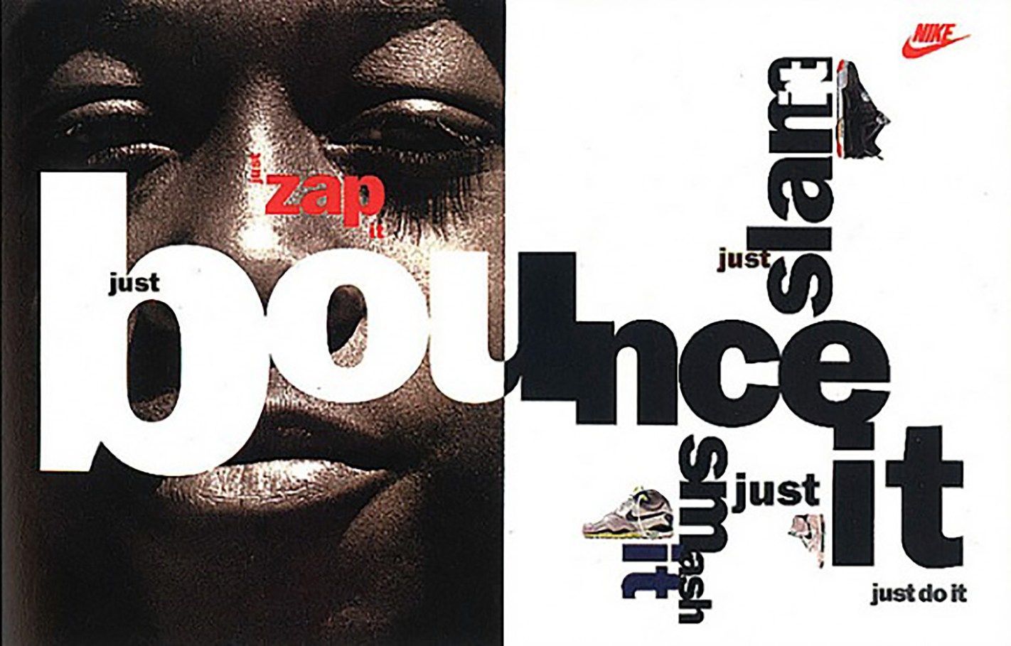
Carson’s influence extended beyond the pages of Ray Gun. His work for brands like Nike, Pepsi, and Levi’s redefined the visual language of advertising, infusing it with a raw energy and youthful irreverence that resonated with the grunge generation. His Nike ads, in particular, were a masterclass in unconventional typography, featuring distorted letterforms, bold colours, and a sense of movement that captured the dynamism of the brand.
For design students wrestling with the dogmas of formal education, Carson’s work is a breath of fresh air. His disregard for legibility, his intuitive approach to layout, and his willingness to experiment with unconventional materials and techniques have emboldened a generation of designers to trust their instincts and break free from the constraints of the grid. His influence is evident in the proliferation of “grunge typography” and experimental layouts that have become de rigueur in student portfolios and independent zines. It’s as if he’s whispering in their ears, “Chuck the rulebook out the window, kids. Trust your instincts.”
A Legacy of Innovation and Provocation
Of course, not everyone in the design world is a fan of Carson’s approach. Some traditionalists sniff at his work, accusing him of prioritizing style over substance, of sacrificing clarity for the sake of shock value. But even his detractors acknowledge his undeniable influence. He’s sparked a much-needed debate about the role of intuition and emotion in design, pushing the boundaries of what’s considered acceptable and, dare we say, making typography a bit more fun.
Whether you consider him a genius or a heretic, there’s no denying that David Carson has left an enduring legacy. He’s taught a generation of designers to embrace their individuality, to trust their instincts, and to never be afraid to break the rules. In a world that often values conformity, he’s a reminder that creativity thrives on the fringes, where chaos reigns and anything is possible.
About the Author

Related Posts
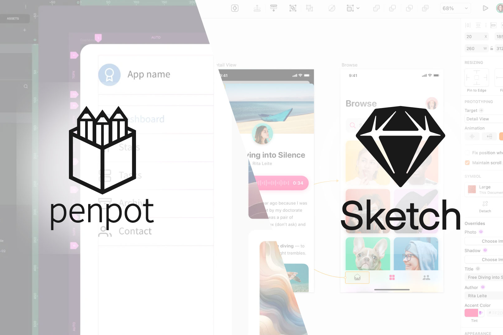
Penpot vs. Sketch: A Comprehensive Comparison for the Discerning Design Professional
In the rapidly evolving landscape of…

Iconic Brands: The Timeless Legacy of British Rail
Step onto the platform of any railway…

The Future of Graphic Design: The Impact of AI and the Role of Human Creativity
The graphic design industry is…
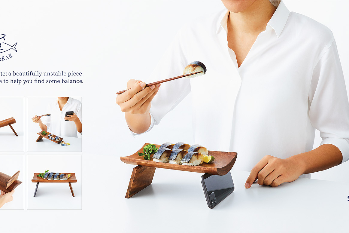
Appreciating a Brilliant Piece of Advertising by the Norwegian Seafood Council
From time to time, you come across…