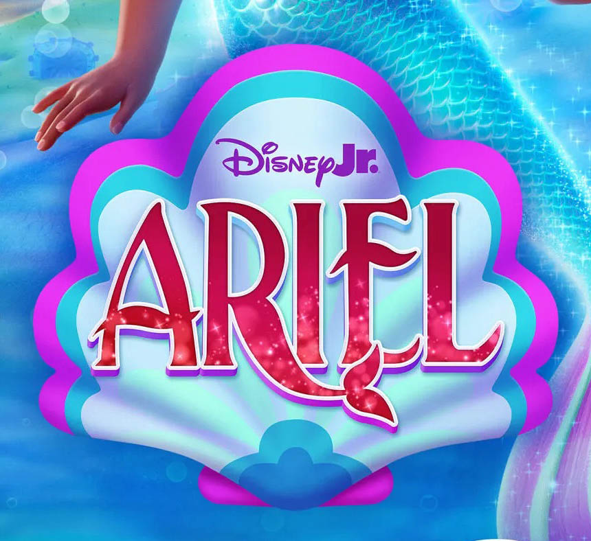
Spotted recently is a new look for Disney Jr. which was probably created by Disney’s no doubt massive in-house design and marketing team. Gone is the flat, geometric blocky look of old and in comes a glossy, rounded bevel style, which is honestly reminiscent of Apple’s visual style from around 2005. It’s an interesting choice to say the least, though I’m sure the flat, non-beveled alternate (seen below) will get more use as time goes by, as the 3D bevel look is not the most flexible when it comes to deciding which background colour/image should be placed behind it.
On first glance, you’d be mistaken for thinking that the old logo was the updated version as it is more in keeping with the current design trends (which tend to favour simplicity and flat colours).
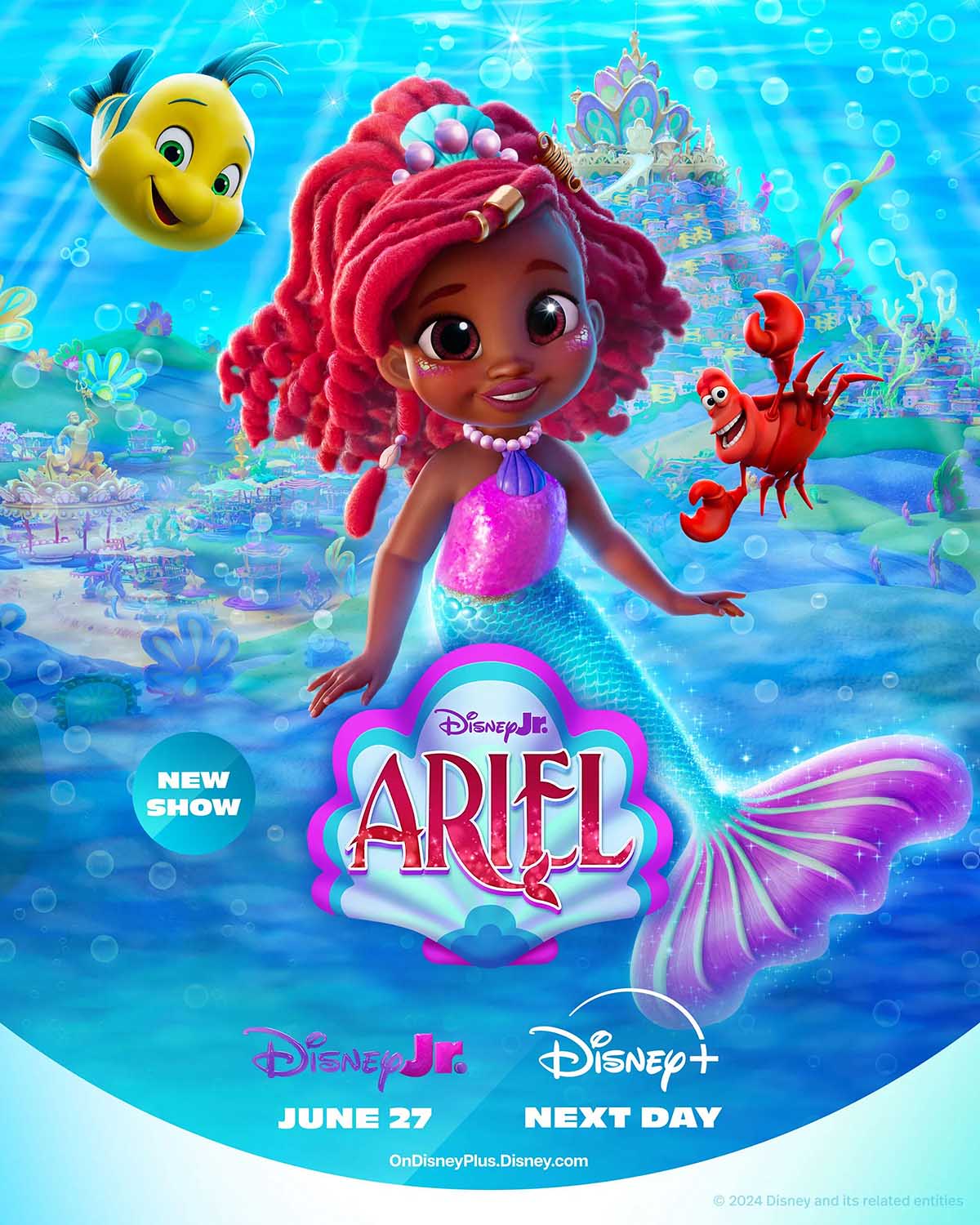
With Disney being the mammoth company that it is with so many entities and IPs under its umbrella, there is almost always something being updated or refreshed with regard to branding to watch out for. I’m sure they’ll provide me with plenty more content as this blog continues to age and evolve.
About the Author
Related Posts
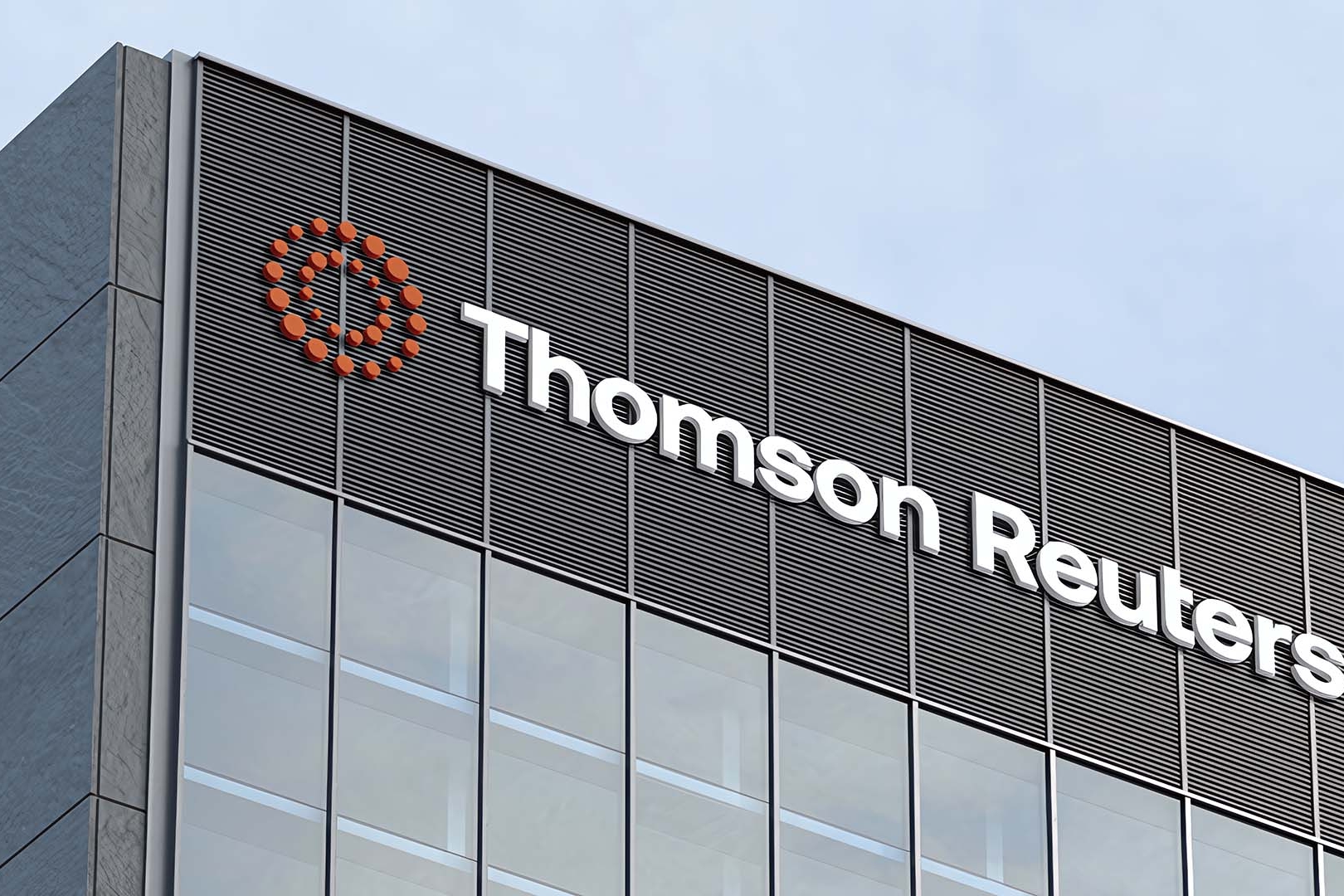
Brand Watch: Thomson Reuters Gets a Brand Update for the First Time in 16 Years
Thomson Reuters, the global content and…
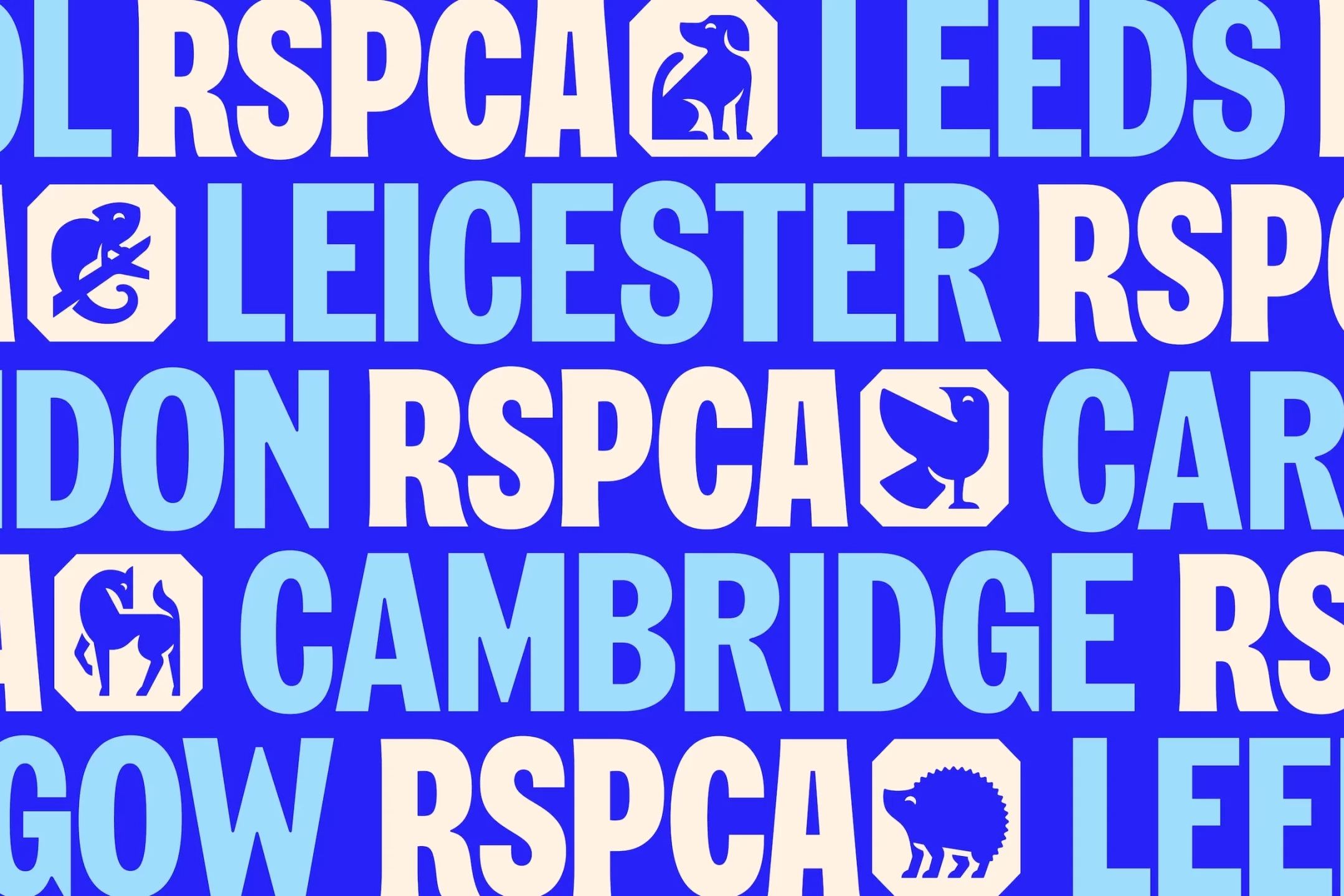
Brand Watch: The RSPCA Gets a Complete Rebrand for the First Time in 50 Years
Fresh off the shelves is a complete…
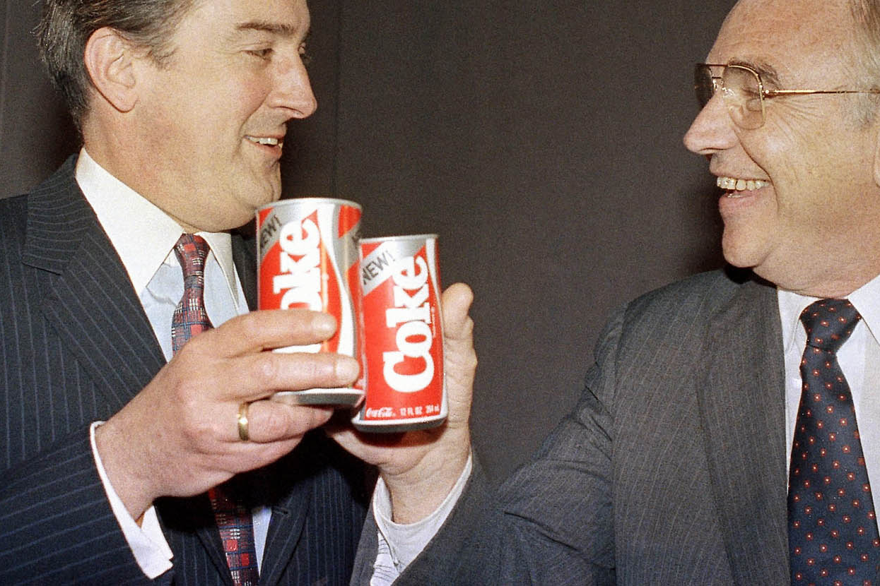
New Coke: A Legendary Marketing Failure… Or Maybe Not?
The year was 1985 and The Coca-Cola…
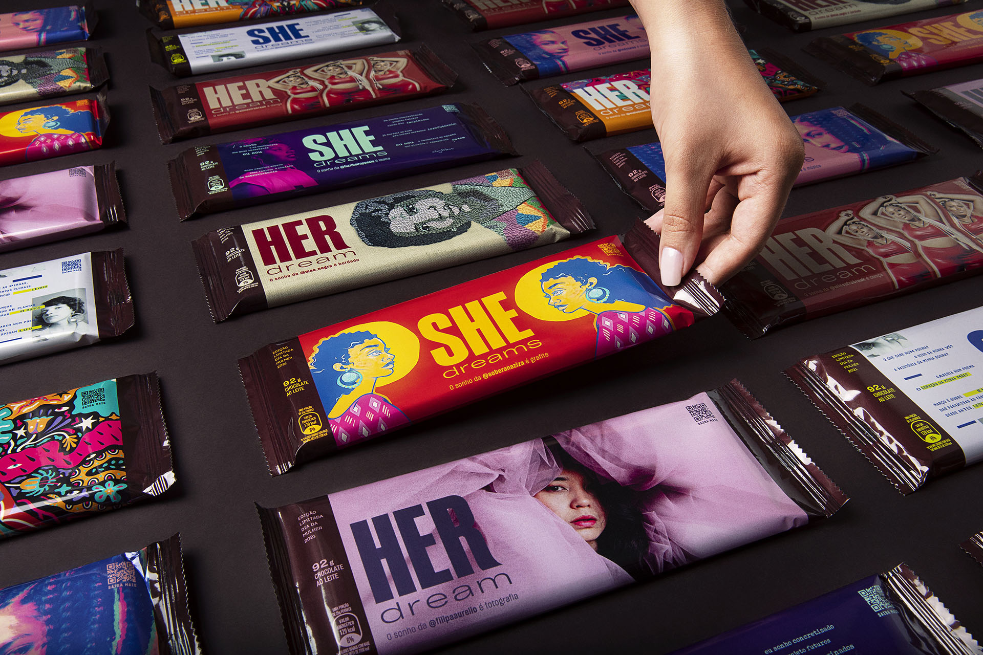
How Hershey’s Leveraged their Brand Recognition for an International Women’s Day Campaign
Hershey's is an iconic brand. Even I,…