Penpot vs. Sketch: Choosing the Right Design Tool for Your Arsenal
In the rapidly evolving landscape of digital design, selecting the right tools can significantly impact a professional’s workflow and output. Two platforms have emerged as prominent contenders in this space: Sketch, a long-established favourite among macOS users, and Penpot, a rising open-source alternative gaining traction for its web-based collaborative capabilities. This in-depth analysis delves into the strengths and limitations of each platform, providing a nuanced comparison to inform the decision-making process for design professionals.
User Interface and Experience
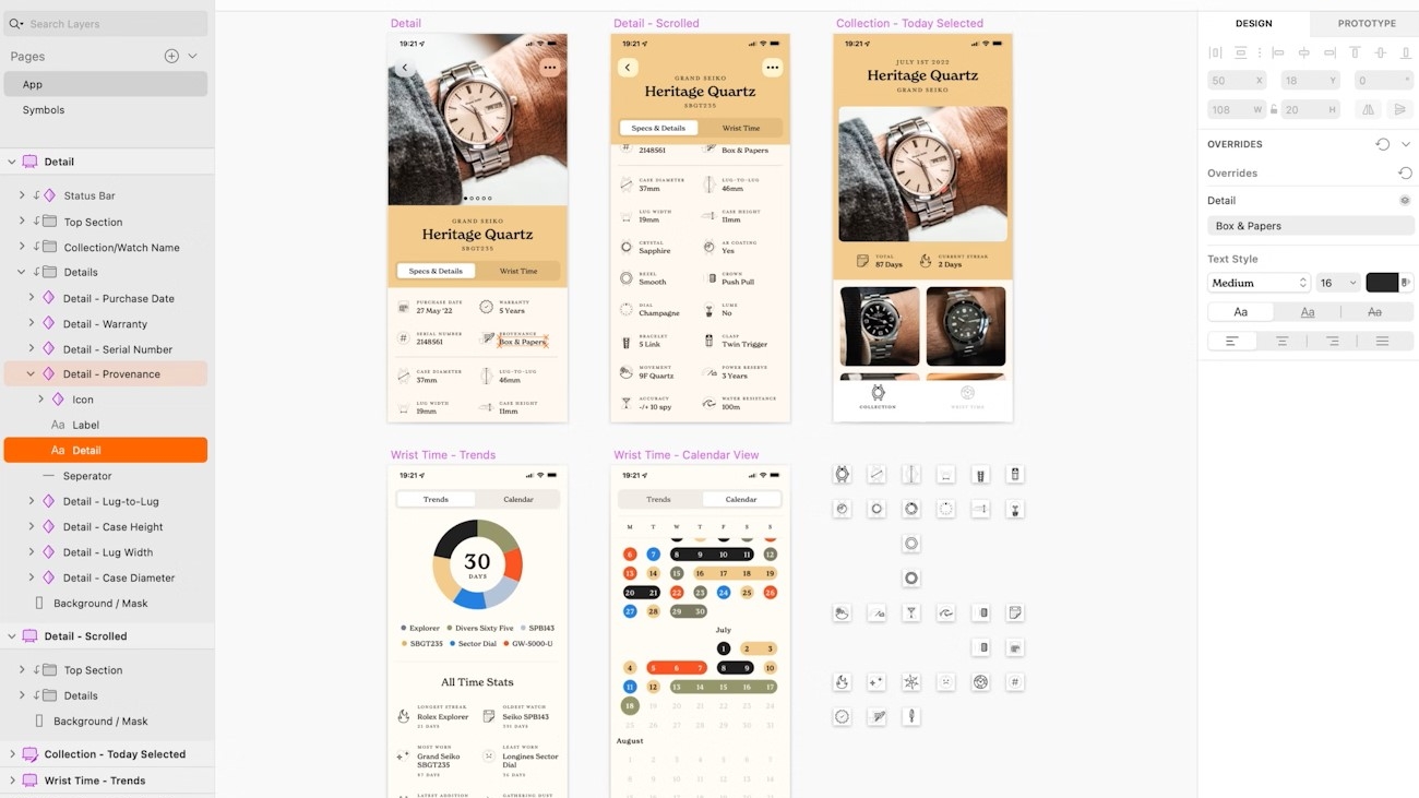
Sketch has garnered widespread acclaim for its refined user interface, often praised for its intuitive navigation and relatively low learning curve, even for those new to the platform. Its robust vector-based editing tools provide precise control over design elements, facilitating granular modifications and ensuring scalability across various resolutions. The platform also boasts a familiar interface that aligns with design conventions found in other macOS applications.
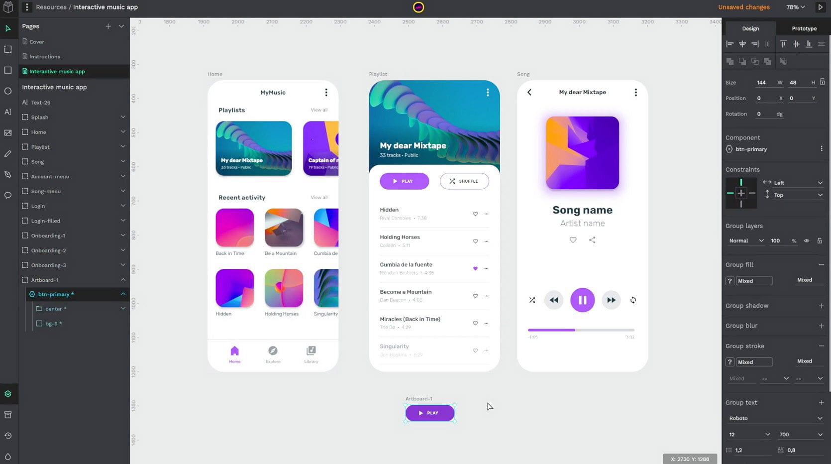
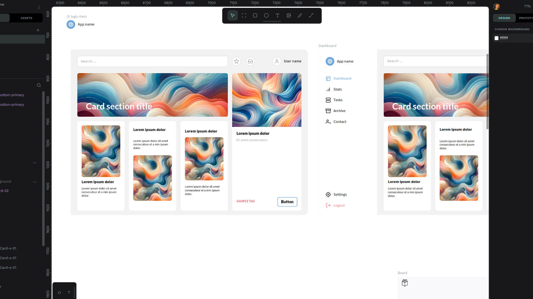
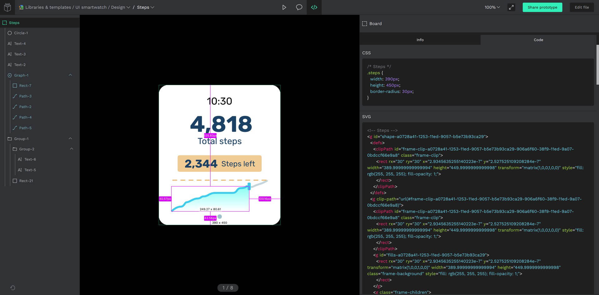
Penpot, while still maturing, presents a clean and modern interface designed with real-time collaboration in mind. Its web-based architecture affords users flexibility, enabling seamless access and editing from any device with a web browser, regardless of operating system. Though its interface might be less familiar to some, Penpot’s intuitive design and comprehensive tutorials make it easy to learn and adapt to.
Collaborative Workflow
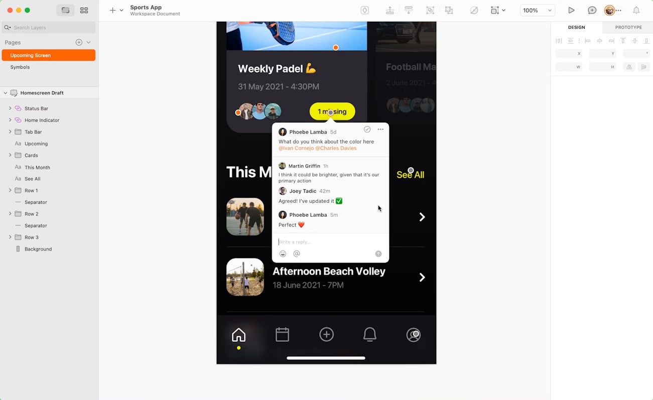
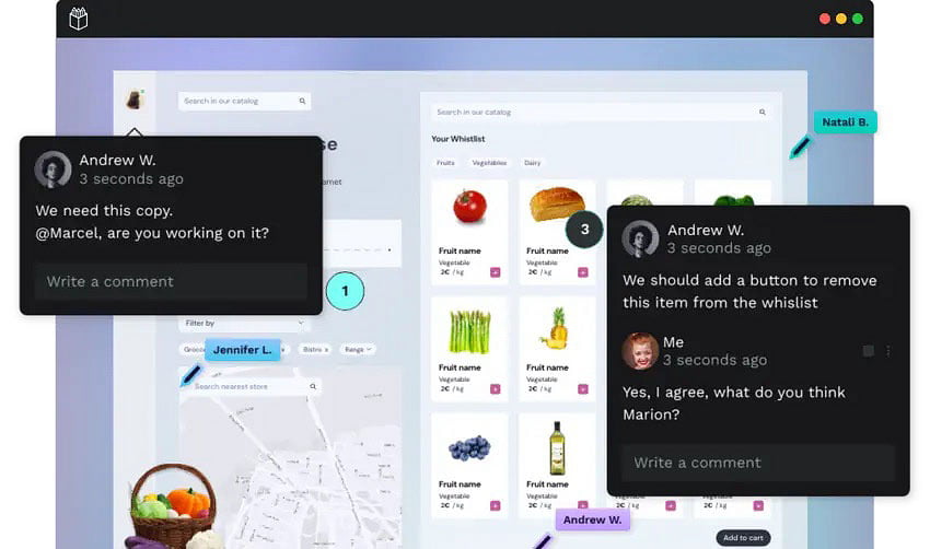
Collaboration is a cornerstone of modern design practices, and it’s here that Penpot truly excels. Its deeply integrated real-time collaboration features allow multiple designers to concurrently contribute to the same project, fostering a dynamic and interactive environment. Users can see each other’s cursors, edits, and comments in real-time, facilitating efficient communication and streamlining the design process. While Sketch for Teams has introduced collaborative functionalities, it does not yet match the seamlessness and fluidity of Penpot’s collaborative workflow.
Extensibility and Customisation
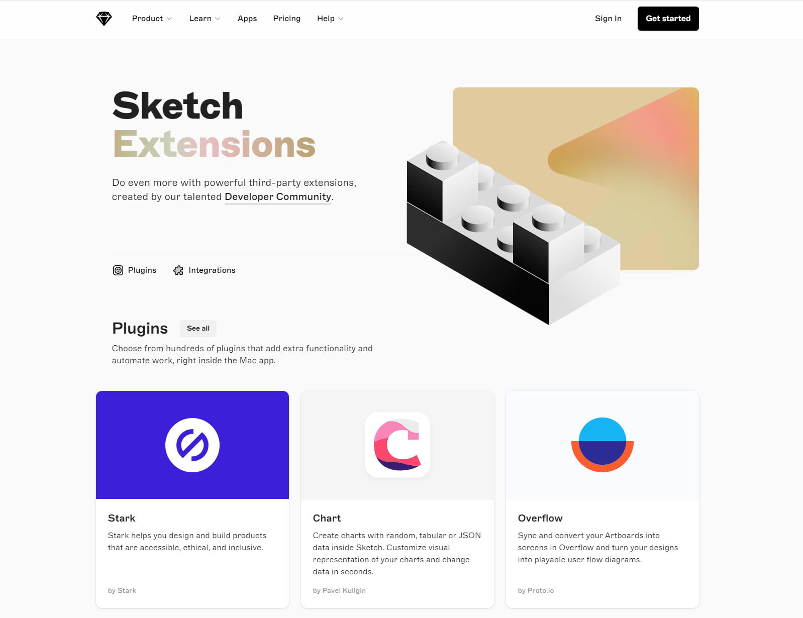
Sketch boasts a vast ecosystem of plugins, providing unparalleled customisation options and seamless integration with an array of third-party tools. This extensibility empowers designers to tailor their workflow to specific project requirements, significantly enhancing Sketch’s core functionalities. From automating repetitive tasks to integrating with project management platforms, Sketch’s plugin ecosystem caters to a wide range of needs. Although Penpot’s plugin library is still expanding, its open-source nature positions it favourably for future growth and customisation potential.
Platform Accessibility and Cost Considerations
A significant distinction between the two platforms lies in their accessibility and cost structures. Sketch’s exclusivity to the macOS ecosystem inherently limits its reach. In contrast, Penpot, as a web-based and open-source platform, offers a democratised approach, granting access to designers on various operating systems without incurring any licensing fees. This cost-effectiveness is particularly appealing to independent designers, small teams, and budget-conscious organisations.
Performance and Stability
As a native desktop application, Sketch generally delivers a more consistent and predictable performance compared to Penpot, which can occasionally exhibit latency or stability issues depending on network conditions and browser capabilities. However, Penpot’s development team is actively addressing these concerns, and the platform’s performance is steadily improving with each iteration. While occasional hiccups may occur, Penpot’s overall performance is generally satisfactory for most design tasks.
So, Which is Right for Me?
Sketch, the veteran of the design world, has long been the darling of Mac devotees, lauded for its sleek interface and extensive features. Its vector-based editing tools are second to none, allowing designers to craft intricate and scalable designs with ease. However, its exclusivity to the macOS ecosystem and subscription-based pricing model may leave some designers feeling left out in the cold.
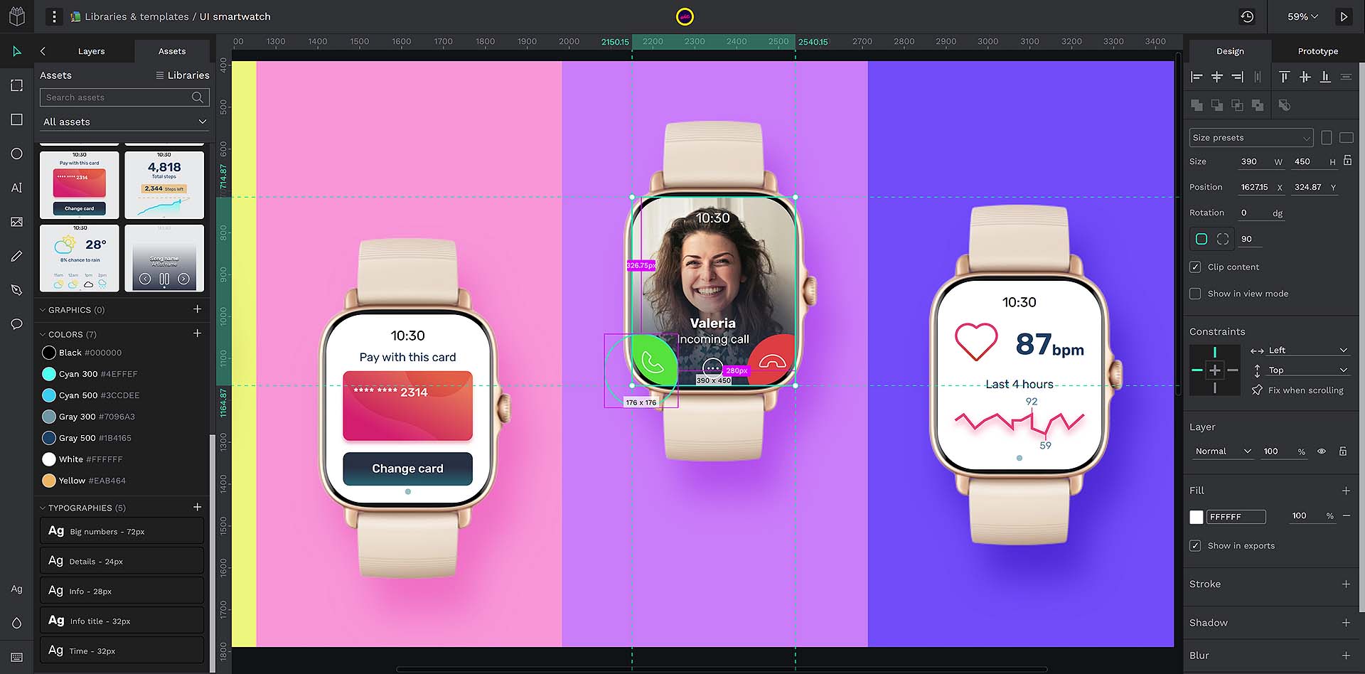
Penpot, the young upstart from the open-source realm, is quickly making a name for itself with its collaborative, platform-agnostic approach. It’s a web-based tool that can be accessed from any device, making it a more democratic option for designers on a budget. Its real-time collaboration features are particularly impressive, allowing teams to work seamlessly together, regardless of location. However, Penpot’s relative youth means its feature set is still maturing, and it may not yet have the depth and breadth of its more established rival.
So, which should you choose? If you’re a Mac user who values a polished interface and a vast ecosystem of plugins, and cost isn’t a major concern, Sketch may be the tool for you. But if you’re looking for a collaborative, cross-platform tool that won’t break the bank, Penpot is a worthy contender that could well be the future of design software.
About the Author

Eoghan Conmey
I am an experienced designer who specialises in logo design & branding, website design & development, 3D modeling and photography. I enjoy learning about the history of design and studying the thought processes and design journeys of some of the most iconic brands in history.
Related Posts
30th April 2024
Brand Watch: The RSPCA Gets a Complete Rebrand for the First Time in 50 Years
Fresh off the shelves is a complete…
24th June 2023
Iconic Brands: The Timeless Legacy of British Rail
Step onto the platform of any railway…
19th February 2023
The Future of Graphic Design: The Impact of AI and the Role of Human Creativity
The graphic design industry is…
